Gifting has never been easier
Perfect if you're short on time or are unable to deliver your gift yourself. Enter your message and select when to send it.
Popular searches
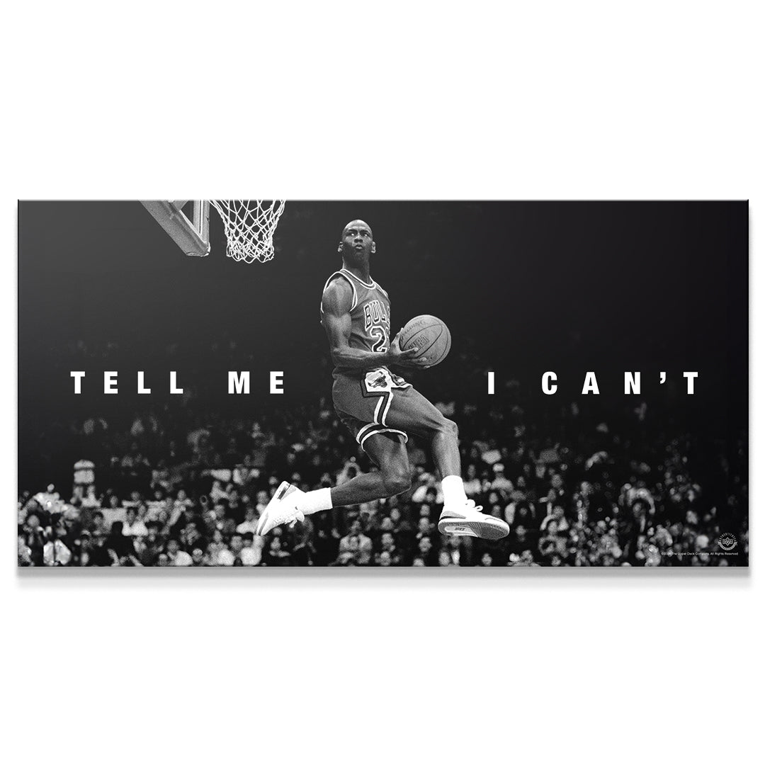
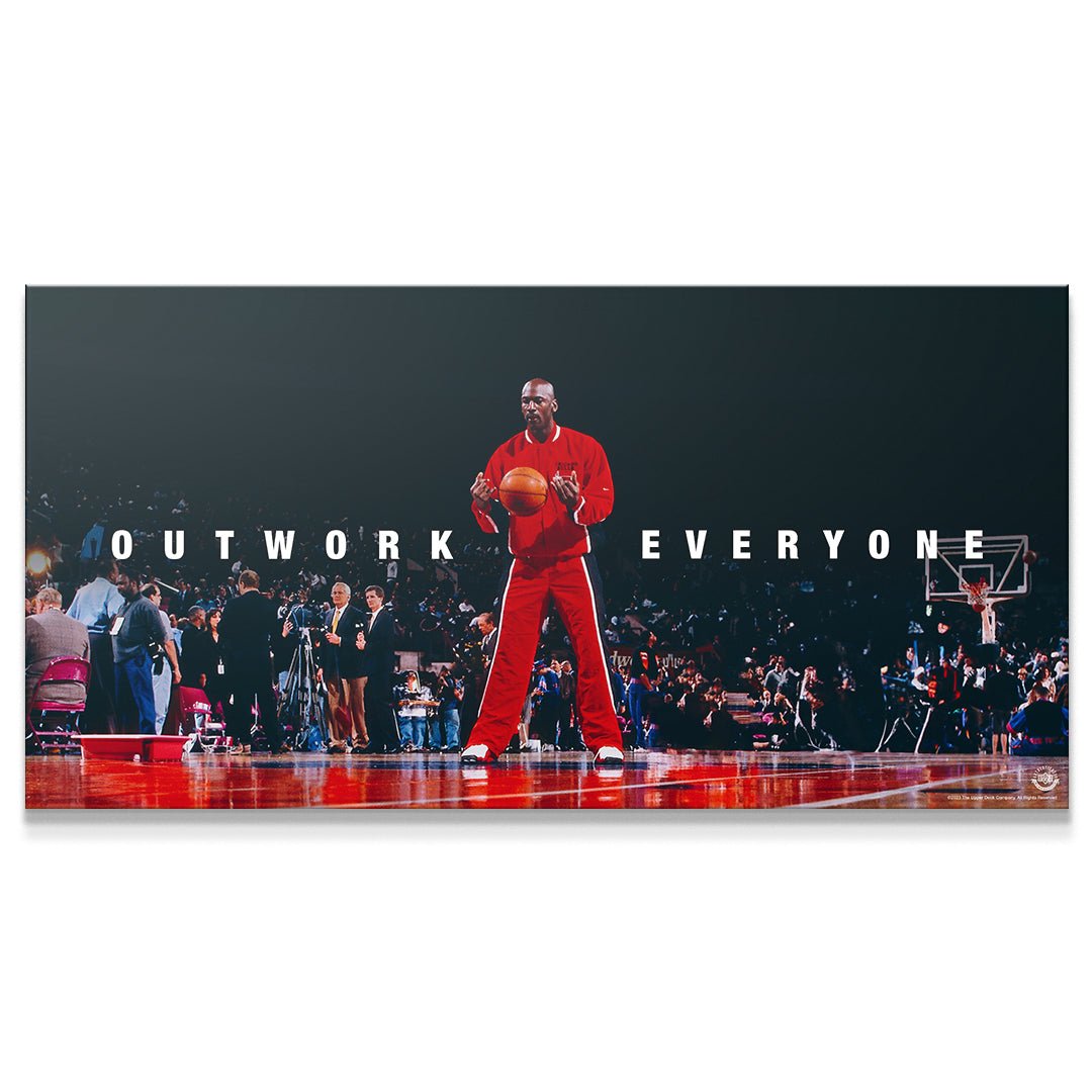
Featured products


Decorating your space with motivational canvas art can be exciting, but it doesn't always go as planned, especially when the colors don’t match. You've probably seen it happen. A bold, inspiring quote in print looks amazing online, but once it's on your wall, something feels off. The room looks disjointed, the message gets lost, or the artwork blends awkwardly with the background. It's not just about liking a piece. It’s about making sure that piece works with your room’s palette.
Color coordination does a lot of heavy lifting when it comes to home and office decor. When things match too much, the art fades into the background. When the contrast is off, the result can be loud or jarring. The right setup should feel natural and balanced. That starts with understanding common mistakes and knowing how to pick tones that bring a room together rather than pulling it apart.
At IKONICK, we focus on producing motivational art that doesn’t just inspire—it fits seamlessly into a variety of spaces and design styles. With the right approach, even bold or unconventional pieces can blend perfectly into your environment.
One of the biggest frustrations when adding motivational art to a room is seeing it clash with everything else. The colors might look great on their own, but in the context of your space, something just feels wrong.
Here are a few frequent issues people run into:
- Too much similarity: If your walls are light gray and your artwork also features mostly light gray tones, the piece may fade into the surroundings. Instead of standing out, it vanishes.
- Unbalanced contrast: A bold neon quote might be eye-catching, but if the rest of your room is soft and neutral, the result could feel chaotic and mismatched.
- Inconsistent color palette: You might fall in love with a piece featuring navy and mustard, but if your space leans into earth tones like olive or rust, it can feel disconnected.
- Seasonal misalignment: Some pieces look and feel better based on the time of year. Dark, rich tones can feel cozy in fall and winter but might feel too heavy in spring or summer.
Getting color right isn't about starting from scratch or giving up on the art you love. It's about finding a balance that captures your style and suits your space.
When finding the perfect motivational art, color coordination plays a major part in how the art interacts with the rest of the room. Luckily, making color work in your favor doesn’t require professional design skills.
Here are a few tried-and-true methods:
Find your room’s dominant colors and check out their complements or close neighbors on a color wheel. Complementary colors—like blue paired with orange—deliver a loud, high-energy contrast. For a softer feel, go with analogous colors, which sit next to each other on the wheel, like blue, blue-green, and green.
A black, white, tan, or cream background helps the quote or central figure in your art pop. Neutrals are adaptable and work with just about any existing palette, especially if you're unsure how bold to go.
If your space is mostly light and muted, a brilliant, colorful piece can bring focus to the wall. If the room already has a lot of color, a print with fewer hues might help draw the eyes without overstimulation.
This simple idea works better than most think. Warm tones like gold, red, orange, and brown feel rich and cozy and often work great in family rooms. Cool colors like blue, teal, and soft gray pair beautifully with calm, clean spaces or home offices that need a boost in focus.
Art that’s intentional in tone and contrast connects with its surroundings and makes everything feel complete. It’s not about matching exactly. It’s about making sure every piece in the room speaks the same visual language.
Each room in a house (or even in an office) has a different function and personality. Matching your art to that purpose helps the entire space feel grounded.
This area usually brings people together, so it’s helpful for the artwork to link multiple design elements. Look at the hues of your largest furniture pieces like the couch, area rug, or curtains. Even if the art isn’t an exact match, prints with subtle nods to those key colors will feel intentional and cohesive. A splash of contrast always works here too, as long as the undertones tie it back in.
This is where calm matters most. Art that uses softer, more muted color schemes can match or lightly contrast bedding, throws, and initial wall tones. Pastels, taupes, and diluted earth colors work well. Try to avoid high-impact contrast in the bedroom, as it can overwhelm rather than comfort.
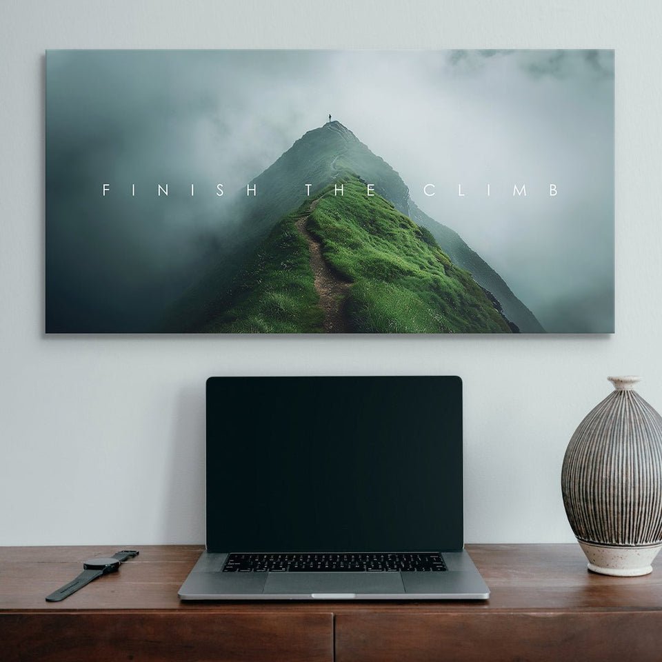
Motivational art fits perfectly here, especially when it's energizing. Bold prints with clean lettering and strong shapes can elevate a workspace. Choose artwork that features productivity-focused messages along with vibrant but balanced shades like blue, red, or green. These tones feel active without distracting from the task at hand.
The right color energy in these spaces leads to a natural harmony that helps your decor work together rather than compete.
Trends come and go, but the way a piece makes you feel stays. A motivational print that connects with your beliefs or history can take center stage in your space, even if it’s a little off-scheme. Your space should work for you first.
That said, certain color and style trends do help people find a visual language they enjoy. Minimalist art continues to rise in popularity, mostly because it blends easily with various decor styles. Soft blacks, warm beiges, and monochrome sets are resonating right now due to their ability to either stand alone or support bolder design choices.
Nature-inspired color palettes are another favorite. They bring the outdoors in through calm greens, stone-like grays, or rusty reds. These palettes offer a grounding effect for homes or offices that need a little calmness in the chaos.
Pop culture-themed and sports-themed art is also gaining traction. These options bring a touch of individuality to spaces and work best when paired with complementary or neutral palettes that allow the hero of the artwork to shine.
IKONICK offers pieces that strike a balance between trend, meaning, and adaptability. The goal is to give you options that reflect your taste and fit whatever space you call home or work.
Matching motivational art with your room doesn’t have to feel like a puzzle. With a basic understanding of how colors work together, along with a little effort and intuition, you can design a space that feels put-together without losing personality.
Your living room could become more grounded. Your bedroom might feel calmer. That office space might motivate you a bit more each morning. It all starts with choosing colors and styles that play well with the rest of your decor while still reflecting your own point of view.
IKONICK focuses on helping people find artwork that speaks not just to their style, but to their purpose. With different designs, sizes, and themes, it’s easy to find something that works in any space—and looks damn good too.
Elevate your workspace with art that seamlessly blends style and motivation. Discover IKONICK's collection of modern office wall art that inspires productivity and complements your decor. Whether you need a standout piece to anchor a room or subtle designs that enhance your professional environment, our selection is crafted to suit any aesthetic. Transform your office today with pieces that reflect your ambition and boost your focus.
Read more

Decorating a small apartment comes with its own set of challenges, but music-themed wall art can make a big difference without taking up any extra room. The walls work like a blank stage, waiting f...
Decorating a small apartment comes with its own set of challenges, but music-themed wall art can make a big difference without taking up any extra room. The walls work like a blank stage, waiting f...